
Catharsis
A native streaming app that curates movies based on various genres for iOS and Android.
There is a function for the artistically leaning user’s that find inspiration from cinematic colourscapes and moods. They can generate colour palettes using an image, time of the movie, and URL’s.
UX DESIGN
UI DESIGN
NATIVE iOS
NATIVE ANDROID


About the Project
The brief for this project was to conceptualize and design a native iOS and Android app to tackle a real world problem. This app represents concerns with streaming apps providing abundant choices (Hick's Law), lack of quality content, and being trapped in the algorithmic cycle.
Role
UX Research Designer,
UI Designer
Software
Adobe XD, Photoshop, Illustrator
Duration
April 15 – May 30, 2022
Category
Media, Streaming, Entertainment
Platform
iOS and Android

The Problem
Existing entertainment platforms have an exuberant amount of content and no one platform has the range all user’s enjoy. It invariably takes more time to find something to consume then to consume the content. People inevitably purchase multiple subscriptions to consume content that they enjoy. This does not create a cohesive and consistent algorithm for a users preferences.
There is a market for user’s that enjoy quality content over quantity optimising their leisure time for watching content as opposed to finding something. User’s would like to explore cinema from around the world if they are given the appropriate exposure and opportunity. It can be deeply satisfying to find a new director or actor whose work one enjoys watching.
The Beginning
Competitive Analysis
For Streaming Apps
The competitive analysis for media channels like Mubi, Criterion Collection, and Netflix brought about insights about user’s needs, pain points, and preferences for consuming content. These were some of the insights collected from the analysis.

For Colour Palette Generator Apps
The competitive analysis for color palette apps like Coolers (iOS) and Pigments (Android) were useful in understanding the overall flows and functions to incorporate into the app. There were utilitarian functionalities along with a visually stunning layout and UX.

User Pain Points
User pain points from the analysis lead to interesting and insightful revelations about the feelings, thoughts, actions, and behaviors of user’s around media and content consumption.

Defining the Problem
Who?
The app is for users that are art and cinema lovers. Users that want quality over quantity would be the target audience.
What?
Tasks to accomplish:
-
Select and play movies.
-
Create color palettes using movie stills and save them.
-
Add a movie to a watch list.
When?
The audience will use this app at home, on-the-go, work or any time of the day.
Where?
They will use this app on their mobile screens. It can be accessed anywhere the user wants i.e. at home, work, and during their daily commute.
Why?
The app caters to the user’s entertainment needs and admiration for art. The app can utilize various features of the operating systems of both iOS and Material design for a better experience.
Persona's
Diving deeper into the process to understand the user, along with the situations within which they would access the app, assists in building and figuring out pain points and tasks needed to fulfill their unique needs and desires.
Creating persona's helps to build empathy with the user; channeling their subconscious thoughts and requirements into actionable tasks offers further insights.

User Flow


Low Fidelity Wireframes
Understanding user pain points from the analysis and overall UX process lead to interesting and insightful revelations about the feelings, thoughts, actions, and behaviors of user’s around media and content consumption.
Overall, these wireframes facilitate in the creation of a cohesive brand utilising a style guide that can be applied to both while keeping the guidelines for Human Interface and Material design.
Android: Material Design


iOS: Human Interface Guidelines


Style Guide
The colour and typography selected for this brand kept in mind the history and future of cinema. The serif font (Abril Fatface) evokes a nostalgic and sentimental feeling towards cinema, while the san serif typeface (DIN 2014) summons a future-facing and experimental nudge to cinema, with its promise to deliver new and compelling ways of storytelling. This pleasure and
excitement of the human experience and its visually compelling medium is what the brand - Catharsis - captures.
The colours (black, white, and an accented orange) come from the black and white era of filmmaking, which stays consistent and true to the experimental leap cinema has taken and the energy that is awakened within the viewer through this medium of art.
Moodboard

Typography
Abril Fatface
Designed by: TypeTogether
DIN 2014
Designed by: Vasily Biryukov from Paratype

Colour

Components

Final Design
Catharsis is a native streaming app for Android and iOS platforms. It utilises the platform guidelines and achieves a systematic way to consume content while targeting pain points users experience with other commonly used apps in the market. Here are the iterations that lead to the final design.

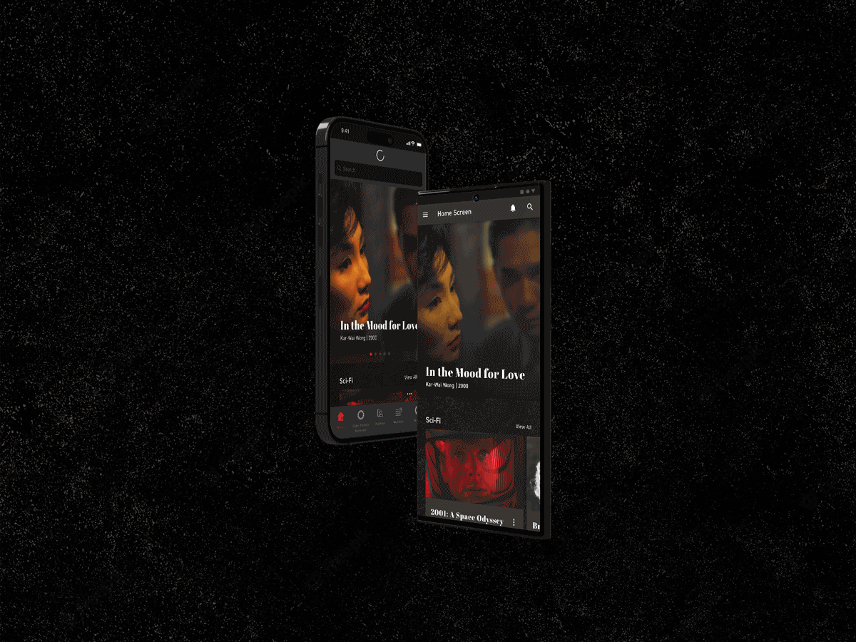
Catharsis: A Movie Streaming App

HOME & NAVIGATION

Android Screens
iOS Screens
SEARCH THE MOVIE & STREAM


iOS Screens
Android Screens
COLOUR PALETTE GENERATOR
Android Screens

iOS Screens

SAVING COLOUR PALETTES & MOVIE LISTS
Android Screens


iOS Screens
Back to the top
Next Project
Role